
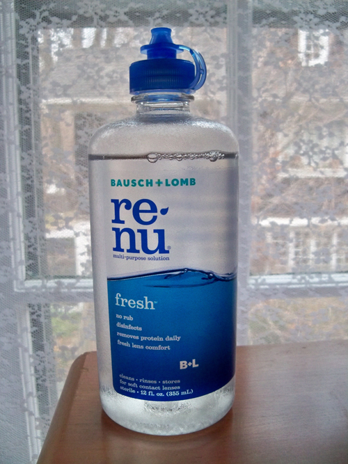
When you think of contact solution what do you picture? The typical white bottle with blue lettering. I have worn contacts since college and that design has barely waivered. I was so surprised when I bought a new bottle of Bausch & Lomb renu contact solution - look at the new bottle design! It is clear and fresh looking, I really like it. Sometimes it pays to break the mold.
For a second, I thought that was a water bottle, like a promotional thing. Then, I thought "that might get a little confusing".. but I agree - it's really pretty!
ReplyDeleteIt does look good enough to drink - but it's nice - and now I can finally have an idea how much is left!
ReplyDeleteLuckily it would be hard to slurp water out of that little squirty top.
ReplyDeleteIt is nice to see how much you have left, and it looks so fresh! But I wonder if clear is the best idea, since stuff can grow in response to sunlight (algae, for instance, and fungi - stuff that's fueled by photosynthesis). Thanks for posting!
ReplyDeletejolene - ew I will have to be sure to keep mine in the cupboard and not in sunlight!
ReplyDeleteunrelated, but I saw this and thought of you: http://sf.eater.com/archives/2009/12/07/sprinkles_phenomenon_to_descend_upon_the_bay_for_a_day.php
ReplyDeleteJenny - Thanks for the kudos on the new U.S. bottle!
ReplyDelete